Data visualizations don't have to be boring! They can go on our walls! With this goal in mind, I have created this easy to understand graphic visually compares Canada, UK, and India using metrics such as land area, population density, and GDP per capita. I have created same graphic in 2 different color variants, all gray and a dash of yellow.
Comparing Canada, UK, and India
You may also like
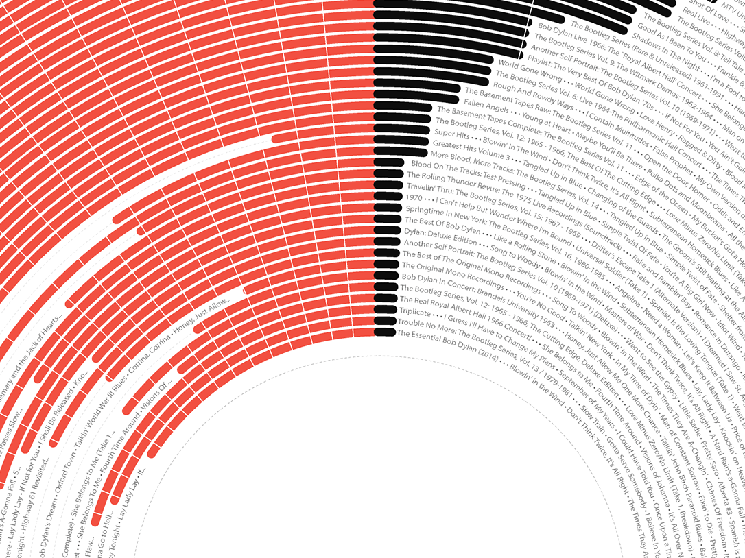
Bob Dylan on Billboard 200 - Light
2022

New York Subway Ridership - Light
2022
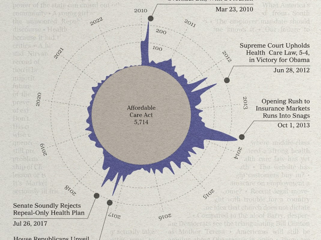
Reflecting on the 2010s
2023

New York Taxi Trips by Hour - Light
2021
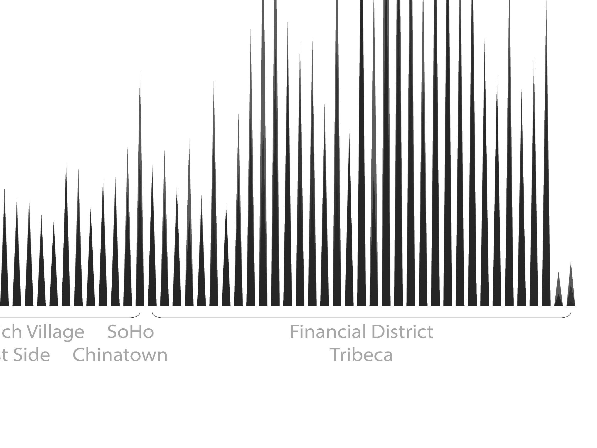
New York City Skyline - Light
2021
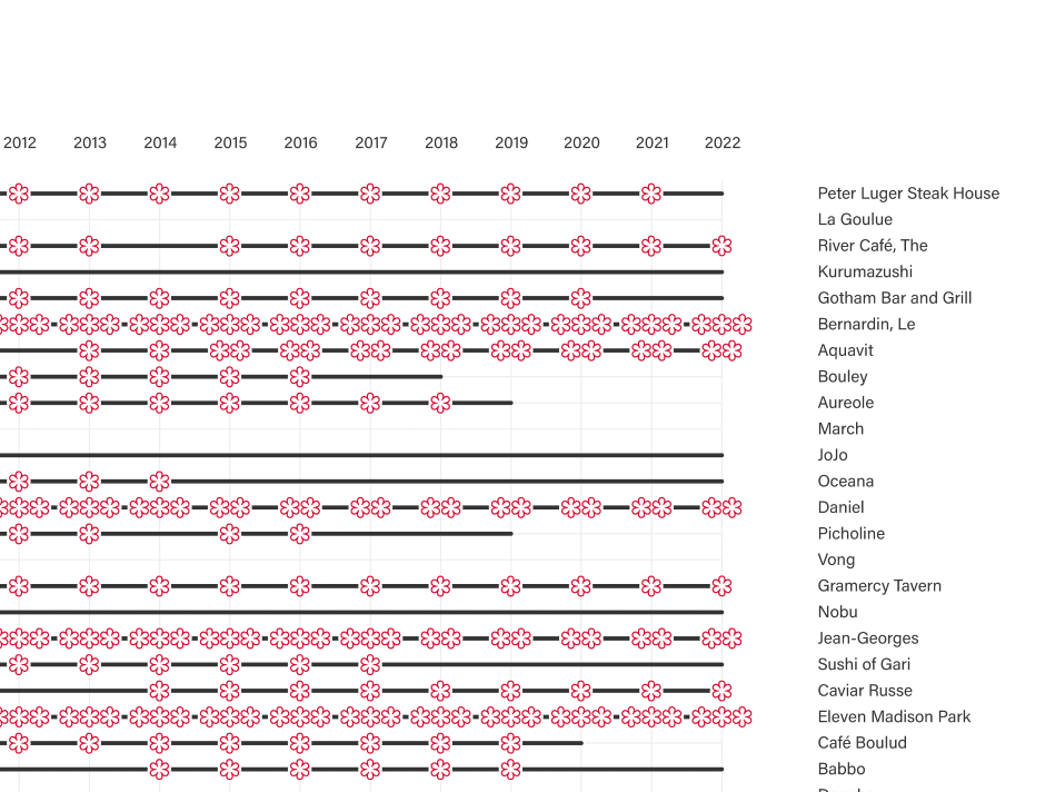
Michelin Star Restaurants in New York City
2023

Oldest Companies in the World - Light
2022
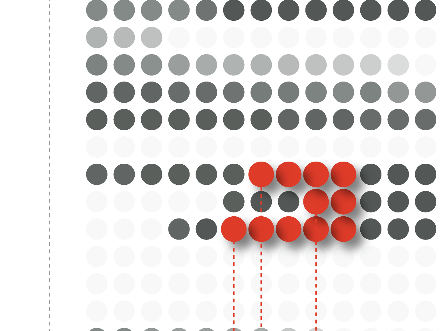
Bob Dylan on Billboard 200 - Light
2022

What can you buy with $25?
2023
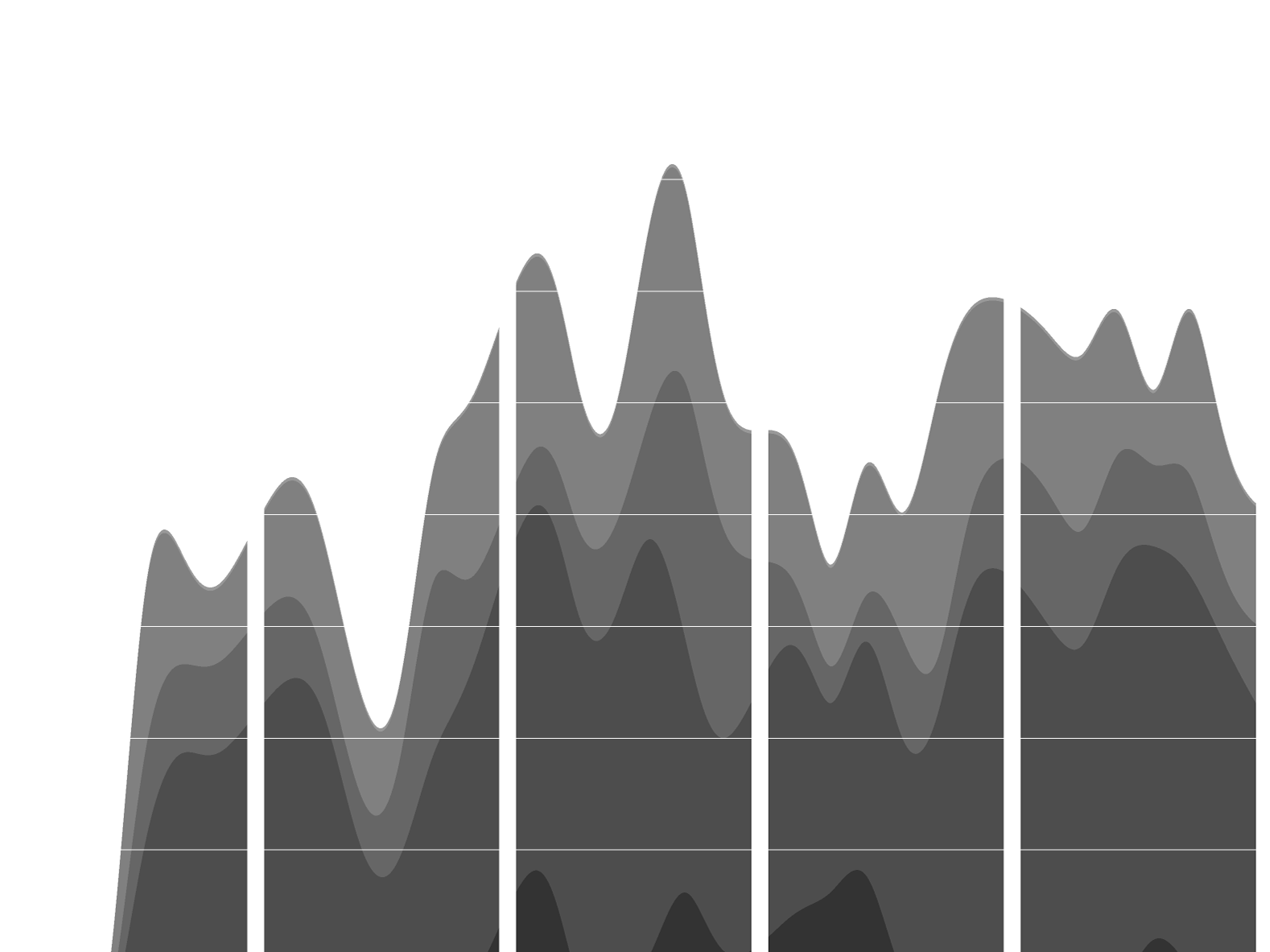
The New York Times, 1851
2023
